Thursday, 30 September 2010


Thought this was a great play with the design of a light. Simply quite funny.


Really like this photography which plays with scale which i think makes it instantly more engaging and interesting. It makes the viewer wonder what it'd be like to live in a world that size. Its humerous as well and is something i want to play with more and more in my work.


Seems to be a constant play with geometric shapes in publications. Think this is to play with the format of the grid and or visual interest.


I like the contrast between geometric shapes and the photo which runs through a shape and ono the background. I feel it grabs the viewers eye easier even though the type is sitting on top of it.


I've been searching and found several pieces of work looking at layout which i am putting up here for inspiration. Whether its a play on grid that i like or the relationship between the type and image i like each piece for specific reasons.
YEAR 3
This year my aim is to produce.....

Research driven publications focusing on layout and typography and their relationship with photography.

My research basis is surrounding design and technology which is taught in schools. I will be taking my research and producing photo and/or type driven publications that will be aimed at school children and be accessible in classrooms.

Thursday, 27 May 2010


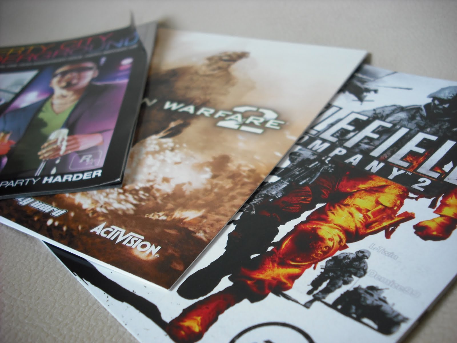
The instruction manuals that come with playstation 3 games use either satin or gloss paper which i like the feel of. They work as booklets with clarity and with a smooth texture. Think i'll use this for my own booklet to have that professional fnish to it.

Sunday, 16 May 2010


The above shoe boxes work by the simple use of a logo. Interesting how the right logo placed in the right place can make something look very professionally designed. I think a logo helps to finish of a design with a professional look as long as used appropriately.


Thursday, 13 May 2010

The below magazine layouts have clear grids which the images and text fit into and align to one another. This will be the case with the logo and text in my own booklet but the images will dominate the pages and spread across, and loosely fitting around the text. Hopefully the mixture of constraints of the grids and looseness of the images will have a visual appeal to them.