

 Thought this was a great play with the design of a light. Simply quite funny.


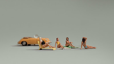
 Really like this photography which plays with scale which i think makes it instantly more engaging and interesting. It makes the viewer wonder what it'd be like to live in a world that size. Its humerous as well and is something i want to play with more and more in my work.


